Highlights
- Google has updated its ‘G’ icon for the first time in nearly 10 years.
- It introduced a more vibrant gradient design where colours smoothly transition instead of remaining solid.
- The update aligns with Google’s current branding, matching the look of Google Gemini and the AI Mode shortcut in Search.
- The new logo has started rolling out on iOS and Android.
Google is updating its well-known ‘G’ icon for the first time in nearly 10 years. The new version is starting to roll out and it brings a fresh, more vibrant look.
Instead of four solid colours, the updated icon now features smooth transitions. The red colour fades into yellow, yellow into green and green into blue. It’s a subtle but colourful change that gives the logo a more modern feel. The new gradient style also matches the look of Google’s Gemini branding and the AI Mode shortcut in Search.
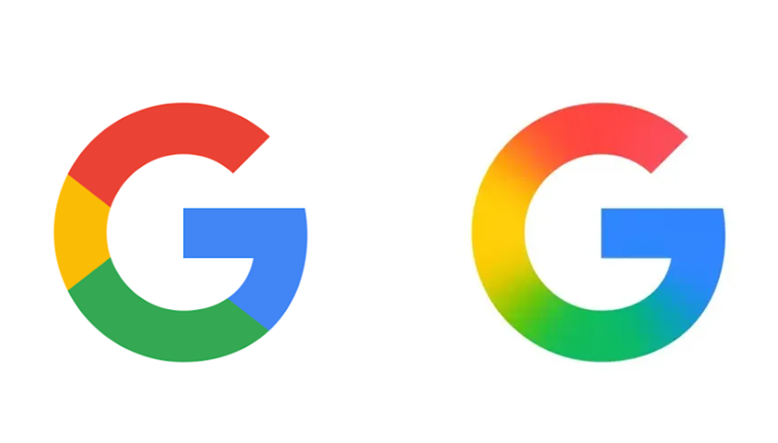
Caption – Google’s old logo (left) Vs the new ‘G’ Logo (right). (Image credit – 9to5Google)
Users might have already seen the new ‘G’ if you use the Google Search app on iOS as it was updated recently. Android users saw it arrive earlier this week with the Google app version 16.18 (beta). The change is small, so if you mostly see the icon on users’ home screens or as a tiny favicon in the browser, users might not notice it right away.
As of now, there’s no sign that Google is updating its full six-letter logo or any other product icons. But in theory, other logos like Chrome or Maps, which also use the same four colours, could eventually get similar gradient updates.
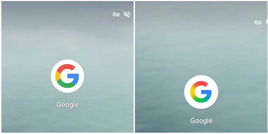
Caption – Android app. (Image credit – 9to5Google)
Caption – iOS app. (Image credit – 9to5Google)
The change was first spotted after it showed up on the Google Search apps for iOS and Android. While some people are joking that the updated icon looks like the old one “without glasses,” the general reaction online seems positive. One user on X said, “A rare logo update that actually looks nice.”
Google made the last major change to its main logo back on September 1, 2015, switching to the Product Sans typeface. That’s also when the current circular ‘G’ icon replaced the old lowercase white ‘g’ on a blue background. The new update is the first tweak to that logo in a decade.
Expect more users to notice the change as it rolls out more widely in the coming days.
FAQs
Q1. What changes has Google made to its ‘G’ logo?
Answer. Google has updated its ‘G’ icon for the first time in nearly 10 years, introducing a more vibrant gradient design where colors smoothly transition instead of remaining solid.
Q2. Why did Google change its logo?
Answer. The update aligns with Google’s current branding, matching the look of Google Gemini and the AI Mode shortcut in Search. The rollout has already started on iOS and Android.
Q3. Will other Google logos be updated?
Answer. There’s no indication that Google plans to change its full six-letter logo or other product icons like Chrome or Maps, but similar gradient updates could happen in the future.
Also Read: