Highlights
- Google accidentally leaked details about Material 3 Expressive ahead of I/O 2025.
- It highlighted a bold new design direction focused on emotional engagement.
- The update includes redesigned battery icons in Android 16, a floating toolbar and a refreshed Google Clock app.
- Tests show users spot key UI elements 4x faster with modernity and innovation perceptions increasing significantly across all age groups.
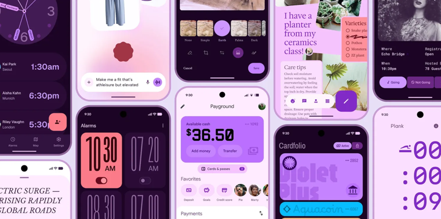
Caption – Android’s Material 3 Expressive. (Image credit – Google via Wayback Machine)
Google is getting ready for its I/O 2025 event later this month, where it’s expected to talk about Android, Chrome, Google Cloud, Gemini, Android XR and more. But ahead of the event, Google accidentally posted a blog revealing details about Android’s upcoming Material 3 Expressive design language.
Although the post was quickly taken down, it was saved by the Wayback Machine and spotted by 9to5Google. According to the blog, Material 3 Expressive is also called “M3 Expressive” or just “expressive design” and is part of a “bold new direction for design” and is “the most-researched update to Google’s design system, ever.” Here’s what we know after the recent leaks.
Google Accidentally Leaks Android’s Material 3 Expressive design
Caption – Android’s Material 3 Expressive or M3 Expressive design details leaked. (Image credit – Google via 9To5 Google)
In the now-removed blog post, Google says the main idea behind this new design is to move beyond “clean” and “boring” interfaces and instead build apps that “connect with people on an emotional level.” The key elements of expressive design include colour, shape, size, motion and containment. The update is all about bold visuals and more engaging experiences.
“These design aspects are also fundamental to what makes a product more usable by drawing attention to what matters in the interface: Making key actions stand out, and grouping like elements together,” Google wrote in the blog post.
One of the standout features is a new floating toolbar, a pill-shaped bottom bar that doesn’t stretch across the full screen, allowing some background to show through. This design is already seen in Google Chat, and edge-to-edge visuals are becoming more common.
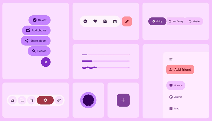
Caption – Android’s Material 3 Expressive. (Image credit – Google via Wayback Machine)
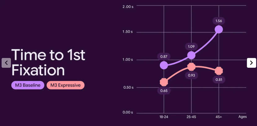
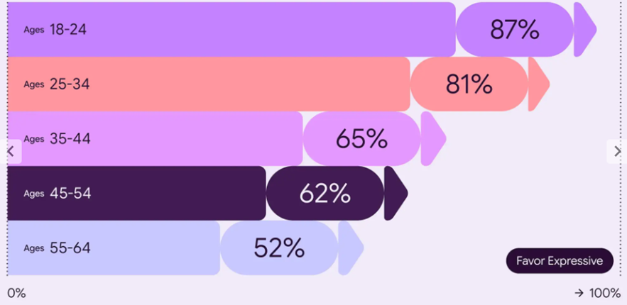
Google’s research shows that users found expressive designs easier to use, helping them spot important actions quickly and navigate faster. The post also noted that expressive design was preferred across all age groups compared to more basic designs, like those that follow Apple’s iOS Human Interface Guidelines.
“… participants were able to spot key UI elements up to 4x faster, showing that these designs work to steer a user’s attention to the most important part of the screen. We’ve seen many apps achieve these levels of improvements, and this extends beyond just eye fixation times. We’ve seen time to tap on key actions decrease by seconds across different designs we’ve tested as well,” the blog post added.

Caption – Android’s Material 3 Expressive. (Image credit – Google via Wayback Machine)
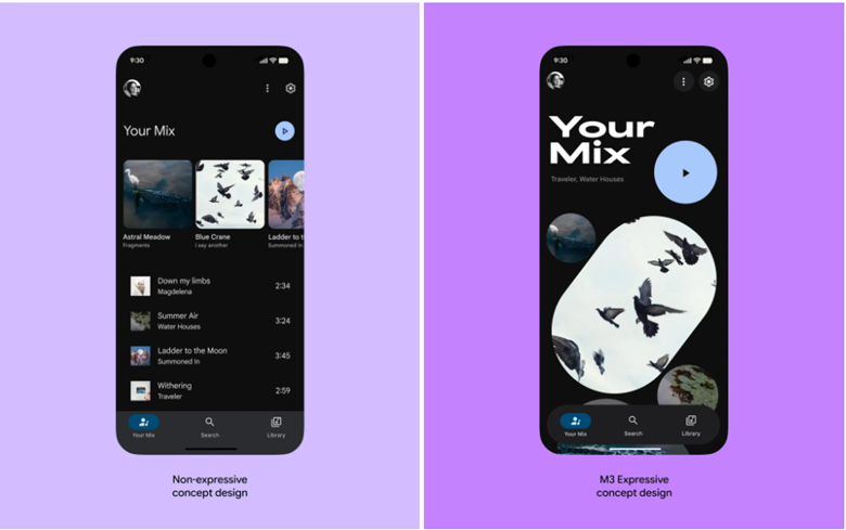
“When we look at particular designs, such as the screens for a case study of an email app below, we can see the benefit of expressive principles directly. For example, the Send button in the new design is larger, placed just above the keyboard, and uses a secondary color to draw attention to it. We can compare this to the non-expressive design, which places the small Send button in the top-of-screen toolbar with other controls like attaching a file. When participants were asked to “Send the email” in the app, their eyes saw the button 4x faster in the expressive design,” the blog explains.
Caption – Android’s Material 3 Expressive. (Image credit – Google via Wayback Machine)
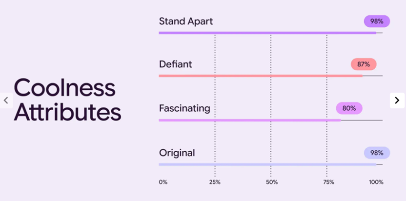
Google even found that using M3 Expressive made products seem cooler and more modern:
- A 32% increase in how “in-the-know” people felt the brand was
- A 34% jump in perceived modernity
- A 30% boost in rebelliousness, suggesting bold innovation
Android 16’s Redesigned Battery Icons and Material 3 Expressive Google Clock Redesign Also Leaked
While we are already seeing hints of this new look, Mystic Leaks on Telegram shared images of a redesigned battery icon in Android 16. It now appears horizontally, has rounded corners, and changes colours based on status, red or yellow at 20% (yellow for battery saver) and green while charging, with icons appearing next to it.

Caption – Recently shared images of the new battery icon in Android 16. (Image credit – Mystic Leaks on Telegram)
The fresh look matches the expressive theme and marks a clear shift from older Android versions.
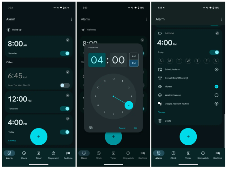
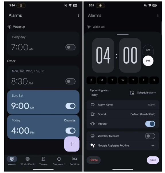
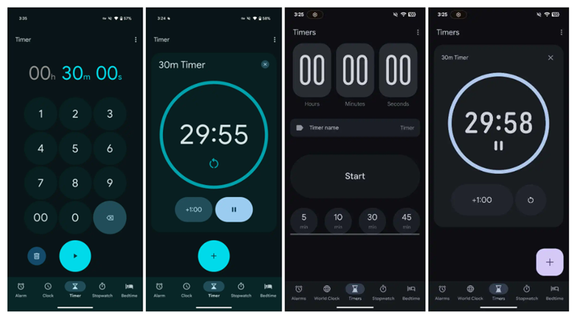
Mystic Leaks also shared screenshots of a redesigned Google Clock app. Changes include:
- A narrower pill-shaped bottom bar
Caption – Current vs upcoming design. (Image credit – Mystic Leaks on Telegram)
- Tweaked tab icons, with names like “World Clock,” “Alarms,” and “Timers”
- A new rounded-square FAB (floating action button)
- Updated UI when editing alarms, with cleaner layouts and a new font
- More obvious action buttons like “Dismiss”
- New toggles using Material 3’s on/off switch style

Caption – Current vs upcoming design. (Image credit – Mystic Leaks on Telegram)
For Timers, you can now set a name right away, and the “play” icon is replaced by a “Start” button. The Stopwatch gets a simplified layout, removing the circular design and replacing icons with large, clear text buttons.

Caption – Current vs upcoming design. (Image credit – Mystic Leaks on Telegram)
The Bedtime tab hasn’t changed much, and the World Clock screen wasn’t shown. The Clock app is now built entirely with Jetpack Compose, which is Google’s modern toolkit for native UI.
Google is using Material 3 Expressive to clean up its apps and make them more user-friendly. While the designs could still change before the final release, it’s clear that expressive design is going to play a big role in Android’s future.
FAQs
Q1. What is Material 3 Expressive, and how does it change Android’s design?
Answer. Material 3 Expressive, or M3 Expressive, is a bold new design language focused on emotional engagement through colour, shape, motion and containment, making interfaces more visually striking and user-friendly.
Q2. What new UI changes are coming with Android 16?
Answer. Android 16 will introduce a redesigned battery icon, new expressive elements, and revamped Google Clock UI, featuring floating toolbars, tweaked tab icons, and refined usability.
Q3. How does M3 Expressive improve user experience?
Answer. Google’s research shows users spot key UI elements 4x faster, making navigation smoother and actions easier to find, while also increasing the modern and innovative feel of apps.
Also Read: Google to Let Kids Under 13 Use Gemini AI With Parental Controls